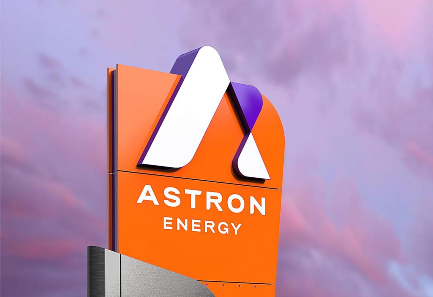
South Africa’s Astron Energy reveals new brand identity
Astron Energy has revealed its new brand identity and a sneak peek into what its network of Caltex service stations in South Africa will look like when more than 850 retail sites are rebranded to Astron Energy.
The name change and rebrand follows the 2018 change of ownership of Astron Energy and its exit from the Chevron group of companies. Since then, Astron Energy has been operating the Caltex brand under a licence agreement. The new corporate brand identity now sees all operations consolidated under a single, unifying brand.
The unveiling of Astron Energy’s new logo and corporate colours, as well as the design of its forecourts, is another important step in the company’s ambition to become the next biggest fuel brand in South Africa.
Astron Energy is South Africa’s second largest petroleum network with more than 850 Caltex-branded service stations in South Africa and Botswana. The existing service station network in South Africa and Botswana will be rebranded in the new corporate colours in a phased manner over the next few years.
In a recent announcement, Astron Energy was awarded first place for customer service in the Petrol Stations Industry in the 2021 Ask Afrika Orange Index, a leading consumer survey to establish which companies provide the best customer experience in South Africa.
“The rebrand is a milestone moment for us on our journey to reimagine and reinvent ourselves. We have been a trusted player in fuels for over a century. We are looking forward to stepping confidently into the future and welcoming all our customers to our exciting new-look forecourts and experiences,” said Astron Energy Interim CEO Braam Smit.
Bold new colors to stand out in a largely undifferentiated market
The brand’s bold new colours were specifically chosen to allow Astron Energy to stand out in a largely undifferentiated market which tends to stick to the traditional colours usually associated with fuel brands.
The rebrand is the most significant and exciting change in the South African oil industry in three decades and certainly one of the largest logistical undertakings as 850+ retail sites, the Cape Town refinery, the lubricants blending plant in Durban, 15 terminals, 180 commercial and industrial sites, as well as corporate facilities will be rebranded.
“Astron Energy is the future of fuel and the rebrand creates the ideal platform to enhance our service offering through innovations and exciting products which are designed to speak to an ever changing consumer landscape,” Smit said.
The rebrand exercise will also see service stations place careful emphasis on the basics, including bathroom facilities and lighting, as part of rejuvenating the overall customer experience.
“The rebrand provides the platform to build out the customer experience even further and to build on the success of the latest Ask Afrika Orange Index win. We have put an enormous amount of work and imagination into our fuel and non-fuel retail offerings and look forward to launching future products and innovations into this fresh, energised and vibrant space,” said Astron Energy General Manager – Marketing, Cambridge Mokanyane.
“We aim to be the brand that matches the pace of people’s lives, while allowing them to recharge and refresh in modern and welcoming service hub environments. Our brand’s positioning is that Astron Energy will give you the energy to make the most of every day.
“Our customer is always front and centre in our thinking. We believe the new look and feel of our forecourts will provide added appeal to our loyal customer base and hold great attraction for those who do not yet have a favourite fuel brand,” Mokanyane added.
First forecourt rebrand in 2022
“A significant change to our motoring or fuel landscape comes around once every few decades and this is really something to be excited about as we look forward to the first forecourt rebrand in the new year,” Mokanyane said. “Our country has been through tremendous challenges as a result of the pandemic and a struggling economy, so it will be wonderful to go into 2022 with a sense of freshness and revitalisation.
“Our new colours and design were carefully chosen to represent our rich new corporate identity which is fueled by progress and inspired by the potential in all of us.
“Colours that are distinctive and non-traditional for the fuel sector, and a logo that is uniquely identifiable were key criteria during the brand development process.”
In August, the company announced that Astron Energy would become the overarching brand across corporate, commercial and retail, and will be the public face of the company at all forecourts and other key sites.


